Nothing comic about Dyslexia
I'm a big fan of the German design magazine FORM. Recently, an ad in the current issue caught my attention – "Helvetica sucks", written in huge Comic Sans letters? In a design magazine? What's happening here?
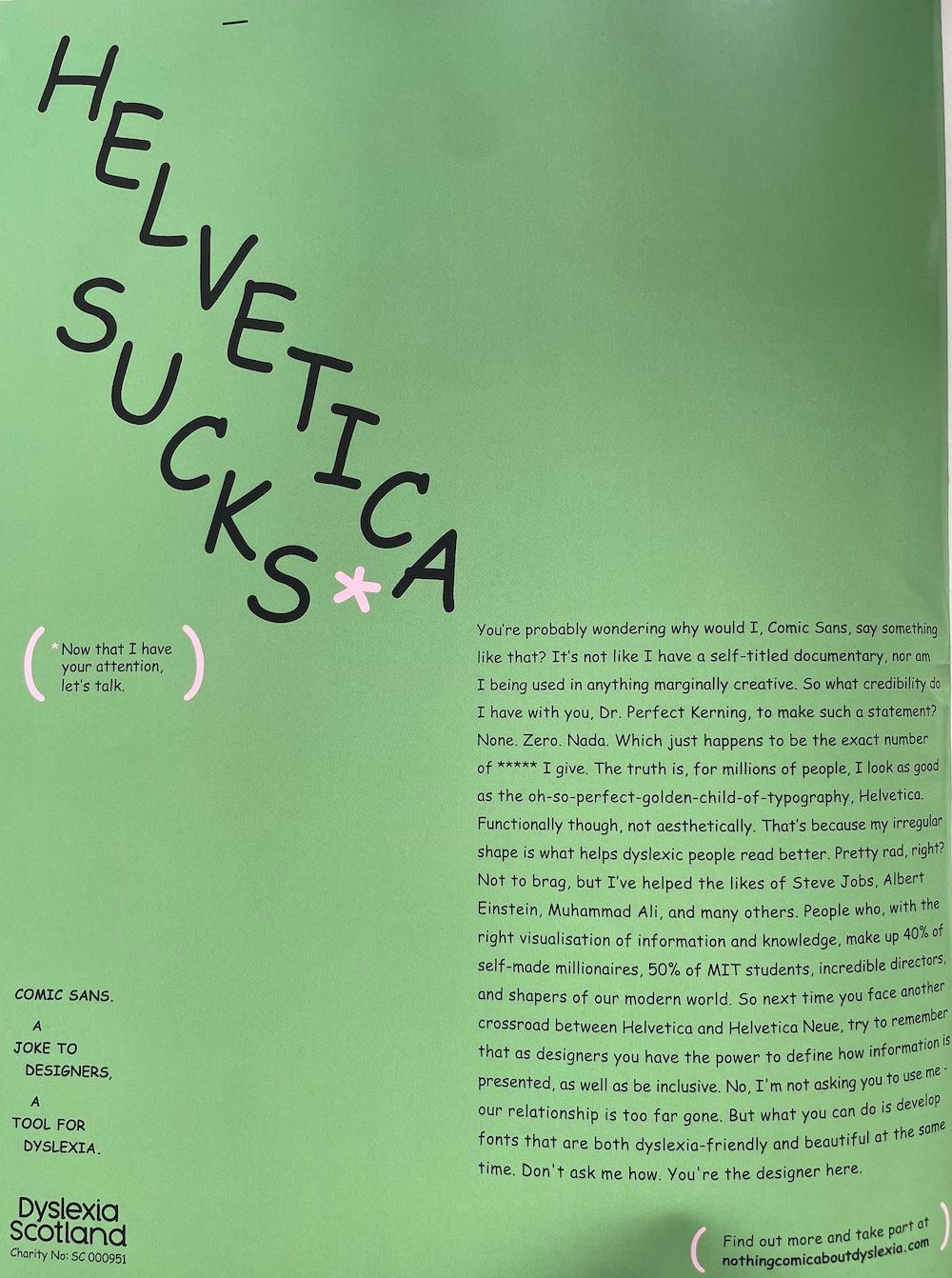
This caught me totally off guard. Comic Sans actually has tangible value? To me, typefaces so far served mostly an aesthetic purpose. But they're actually intended as conveyors of information, at the very basic level. So for people with dyslexia – a whopping 5-17% of the general population, according to Wikipedia – Helvetica is pretty terrible due to it's regularity, and therefore actually ruins the original purpose of the typeface.
Enter Inconstant Regular
So Dyslexia Scotland, the non-profit responsible for above ad, teamed up with designer Daniel Brokstad to develop the typeface Inconstant Regular – a font meant to massively improve legibility for dyslexia-affected people.
The typeface is free for both non-commercial and commercial use. I've decided to give it a shot for replacing Roboto Slab as heading font for this blog. I do enjoy the variability of the typeface, and I think I've found some settings that I also like from an aesthetic perspective (for the CSS nerds, the particular variant I am using can be set via font-feature-settings: 'calt' 0; for both the variable TTF or WOFF font file).
Maybe this makes this blog more accessible for more people 👍